March 24, 2024
Every choropleth map has a strategy for mapping values to colors. A classed choropleth map divides the range of values into classes, and maps these classes to a color scheme. An unclassed choropleth map directly maps the range of values to a color gradient linearly. Which map should we choose?
If we have a clear definition to classify the statistical data, we can use classed choropleth map to find spatial patterns and insights.
The following example shows a classed choropleth map which is classified countries by GDP Per Capita into 5 classes.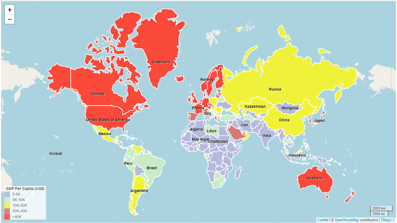
If we don't have a standard definition to classify a variable, we had better to use an unclassed choropleth map to explore and find insights.
The following example shows that an unclassed choropleth map which directly maps the range of GDP Per Capita (US$0-US$240K) to a color gradient (light blue-yellow-red).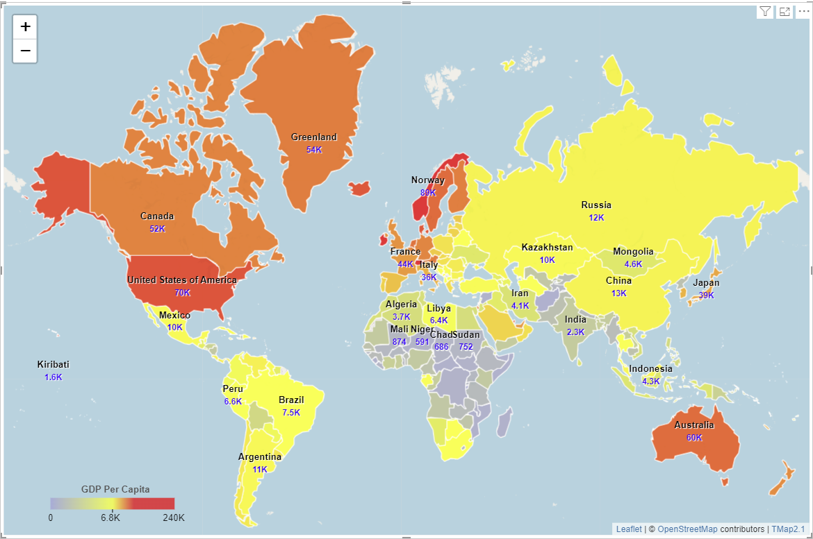
Comparing the two maps presented above, we can see subtle variations for GDP Per Capita on the unclassed choropleth map, but not on the classed choropleth map. For example, GDP Per Capita for Canada is US$52K, and USA is US$70K; on the unclassed map, they have different colors; but on the classssed map, they have the same color. Personally, I like unclassed choropleth map because it is more accurate and easy to make.
Please go to tutorials to find how to make unclassed choropleth map and classed choropleth map in TMap.You can go to Microsoft AppSource to download TMap Visual and try it.